My First Logo Design – Concept to Creation
Welcome back to my creative journey! Today, I’m thrilled to share the process behind my first logo design for Ripple Retreats, a fictional company specializing in tents for the fishing community. As I embarked on this endeavor, I sought to capture the essence of the brand—a love for the outdoors, a sense of adventure, and a connection to nature—in a single visual representation.
Introducing Ripple Retreats
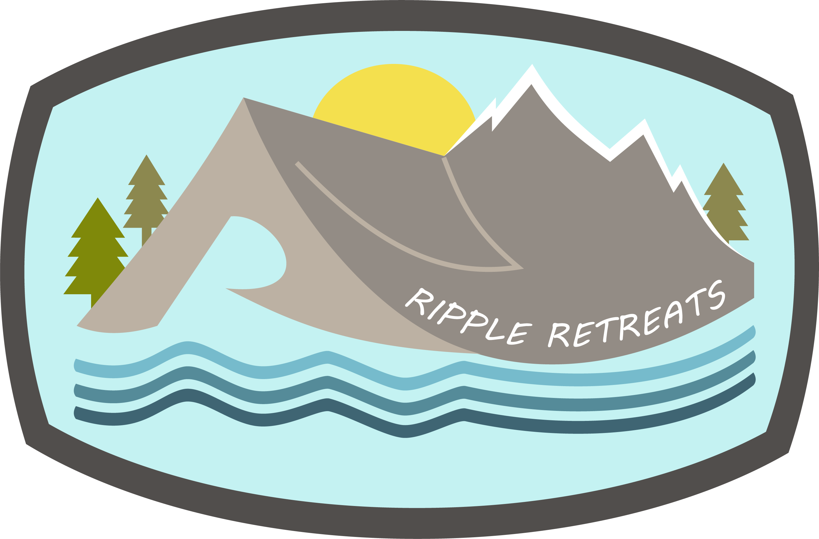
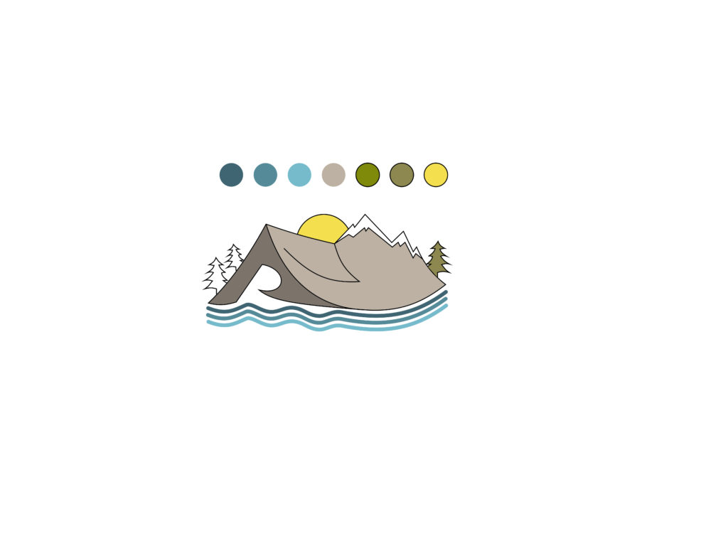
Ripple Retreats is more than just a tent company; it’s a gateway to unforgettable outdoor experiences. Imagining the brand’s identity as a tranquil lakeside retreat, I envisioned a logo that would transport viewers to a serene wilderness setting. The logo features a tent nestled among trees, with a majestic mountain backdrop and the sun rising behind it. Below, ripples represent the gentle movement of water, inviting customers to embark on their own outdoor adventures.
Steps of Creating a Logo
- Research and Inspiration: I began by researching the fishing community and outdoor enthusiasts’ preferences, drawing inspiration from nature’s beauty and the sense of freedom it evokes.
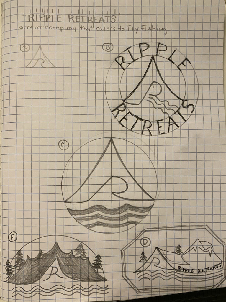
- Conceptualization: Using the insights gained from research, I sketched several concepts, exploring different compositions and elements that would resonate with the brand’s identity.
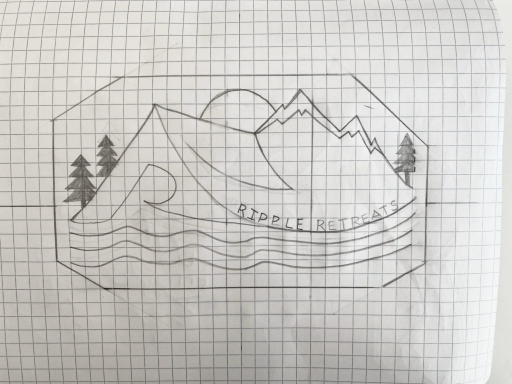
- Refinement and Iteration: After narrowing down the concepts, (with help from some family members) I refined the chosen design, focusing on simplifying and balancing the elements to create a cohesive and visually appealing logo.
- Typography and Detailing: I carefully selected typography that complemented the logo’s aesthetic and added subtle details, such as shaping the tent’s door into an “R,” to reinforce the brand’s identity. Focusing on the door was the win for me. I’m still not happy with the font used on the tent itself. I plan to use this logo and iterate later on in this journey.
- Color Selection: Choosing the right colors was a significant challenge, as I wanted to evoke the warmth and vibrancy of sunrise while maintaining a natural, earthy palette that reflected the brand’s connection to the outdoors. Again, I used a palette one of my daughter’s suggested.
- Finalization: After several rounds of refinement and feedback, I arrived at the final logo design, ready to represent Ripple Retreats’ spirit of adventure and exploration.
Challenges of Color Selection
One of the most challenging aspects of creating the logo was selecting the perfect color palette. Balancing the warmth of sunrise hues with the natural tones of the wilderness required careful consideration and experimentation. Ultimately, I opted for a harmonious blend of earthy greens, warm oranges, and soft blues, evoking a sense of tranquility and adventure
Next Steps: Introducing 10 Daily Challenges
As I reflect on the journey of creating my first logo, I’m filled with a sense of accomplishment and excitement for the road ahead. In the coming days, I’ll be introducing 10 daily challenges to close out the first 30 days of this transformative journey. These challenges will push me to expand my creative horizons, refine my skills, and continue exploring the vast world of visual creation. Stay tuned for updates and insights as I embark on this next phase of my creative journey!
